Cooking at LANL
From autoplot.org
Contents |
1. Cooking at LANL
The folks at LANL asked for a set of procedures and resultant images showing how to get more complex plots.
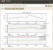
2. Stack of three plots
It's useful for everyone to know how to make a stack of plots.
- plot http://autoplot.org/data/somedata.cdf?Magnitude by pasting this in the address bar, and hitting the play button to plot the data.
- Turn on "Expert" mode if Basic mode is on, checking the upper-right corner for the status.
- File->Add Plot...
- Edit the URI to be http://autoplot.org/data/somedata.cdf?BGSEc. Note the inspect icon will open a GUI to make this easier.
- Hit "Plot Below" to add a new plot below the current "focus" plot.
- Click on the bottom plot to change the focus to one of the plot elements
- File->Add Plot...
- Edit the URI to be http://autoplot.org/data/somedata.cdf?SC_pos_GSM. Note the inspect icon will open a GUI to make this easier.
- Hit "Plot Below" to add a new plot below the current "focus" plot.
- This product could be saved as a vap file using File->Save
3. Efficient stack of three plots
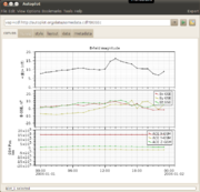
We want to make the stack of three more efficient, removing ticks and putting the labels on the outside.
- Tear off the axis tab so you can see the canvas and the axis tab at the same time.
- right-click on the axis tab, and click "undock"
- Click on the top plot.
- De-select show labels on the X-Axis panel.
- Click on the middle plot.
- Add "B-GSE, nT" to the Y-Axis label.
- De-select show labels and delete the title
- Click on the bottom plot.
- Add "GSM Pos, km" to the Y-Axis label. (Or try "GSM Pos!ckm, for a two-line label)
- Delete the title
- Tools->Fix Layout will remove the extra spaces in between the plots (and overlaps).
4. Tweak Label Position
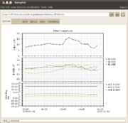
Two plots of our three have labels colliding with data. This shows how to use property editors to move the labels to the outside.
- Right-click (or Ctrl-Click single button mouse on a Mac) on the middle plot, and select "Plot Properties".
- In the middle is "legendPosition", set it to "OutsideNE" and click "apply"
- Repeat the procedure for the bottom plot.
- (Note the default initial legend position will be a user option soon.)
5. Color Scatter Plot
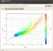
Mike asked how to make a color scatter plot, which is a scatter plot where the points are color-coded.
- File->Add plot...
- Plot the URI: vap+dat:http://autoplot.org/data/sampex.dat?column=field9
- Against X: vap+dat:http://autoplot.org/data/sampex.dat?column=field10
- Against Y: vap+dat:http://autoplot.org/data/sampex.dat?column=field11
- Plot.
- The symbols can be made larger on the style tab.
Right now only one data source can produce data in this form, the Excel Spreadsheet reader, but soon a scheme for rich ascii files will be introduced.


