developer.renderTypes
From autoplot.org
Purpose: demonstrate the RenderTypes available.
Audience: Scientists wanting to know capabilities.
See also: http://autoplot.org/developer.newRenderers which shows how new renderers are created for das2 applications and Autoplot scripts.
Contents |
1. Introduction
Autoplot tries guess a plot type based on the form of the data. For example, a for rank 2 table it uses spectrogram, and for a series of points it uses the series. There are already many ways to render data, many of them will almost never be selected automatically. To manually set the render type, right-click on the display to select an option under the render type submenu, or in a script set the RENDER_TYPE property. See also http://autoplot.org/developer.guessRenderType
2. Spectrogram
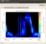
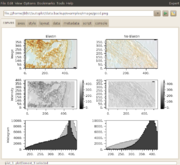
Bi-linear interpolation is used to fill in squares of 4 data points.
ds[X,Y]
There is a plan to add new rebinning methods: developer.spectrogram.rebin
3. Nearest Neighbor Spectrogram
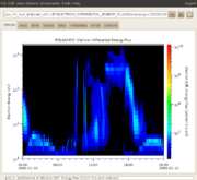
Same as spectrogram, but the nearest neighbor is used. Note there is a setting that makes this the default. Also datasets can hint that they prefer this rendering with the RENDER_TYPE property.
4. Series
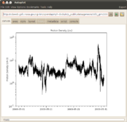
Time series of data painted by connecting successive points. A cadence is established, and points farther away than this cadence are not connected.
5. Fill To Zero
The data is filled in to a reference value, a line where y=value. It has recently been proposed that separate upper and lower thresholds and colors be added. This is never triggered automatically.
6. Scatter
Like a time series, but the connecting lines are not used. This is triggered when a cadence cannot be established.
7. Color Scatter
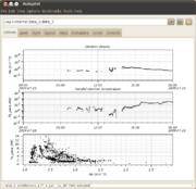
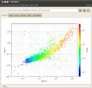
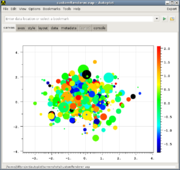
The plot symbols are color-coded to show a third dimension.
vap+inline:rand(200),rand(200),rand(200)
vap+jyds:http://autoplot.org/data/script/schemes/colorScatter.jyds
8. Huge Scatter
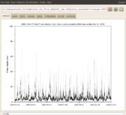
Like a series, but the size of the dataset is sufficient that Series cannot be used. Presently this threshold is 30000 points. Only the color can be controlled, and connections are drawn between data in the same pixel column.
vap+inline:ripples(1000000)
9. Digital
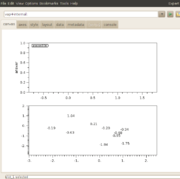
Data are rendered as a formatted text instead of points. Most data can be plotted this way, including rank 0 data, which is displayed in a bubble in the plot corner. The code limits the number of points drawn, presently clipping but soon it will subsample. Here is some python code that demonstrates:
ds= dataset(3.34)
ds.putProperty( QDataSet.LABEL, 'answer' )
plot(ds)
script:http://autoplot.org/data/script/schemes/digital.jy
10. Events Bar
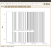
Data in datasets can be from an enumeration, and the associate Units object maps the value to a message. In this case an events bar shows the time and clicking on the bar shows the message.
ds[:,4] where tstart,tstop,rgb,event
ds[:,2] where t,event
http://autoplot.org/data/script/schemes/demoEventsBar.jyds
11. Image
RGB values are painted as an image.
ds[row,column,3] there the 3 is R,G,B.
vap+jpg:http://autoplot.org/data/image/Capture_00158.jpg
12. Orbit
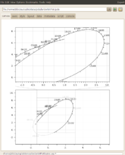
More abstract orbit plot shows a time parameter plotted along a trajectory.
ds[:,3], an array of bundles of time, x, and y.
Y[X[T]]
script:http://autoplot.org/data/script/schemes/orbitDemo.jy
vap+jyds:http://autoplot.org/data/script/schemes/orbitPlot.jyds
13. Pitch Angle Distribution
Pitch angle distributions take rank 2 data in the form:
ds[angle,radius]
where the angle is in radians or has units='deg'
14. Custom
Custom renderers, defined in Python code, will soon be an option. See CustomRenderers.
This shows color and size used to visualize data:
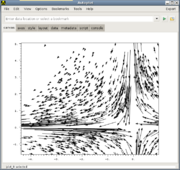
This is where jython code is used to define a renderer that shows flow:
15. Extra labels for axes
Note that X axes can have additional ticks added to them, by right-clicking and providing a dataset URI. (One dataset URI presently, multiple must be done by bundling in Jython script.)
